1. Brand Overview
Derrimut Gym, commonly referenced as Derrimut 24:7 Gym, is a fitness chain in Australia that grew rapidly by offering affordable, round‑the‑clock gym access to members. Founded in Melbourne’s west, the brand expanded with multiple gym locations across Victoria, South Australia, and Queensland, aiming to provide quality exercise facilities, group fitness classes, personal training, and wellness services to a wide audience of gym‑goers.
Derrimut positioned itself as an approachable fitness destination — with equipment, classes, and amenities for both casual exercisers and serious athletes. The company also expanded its retail offerings to include fitness apparel, supplements, accessories, and pre‑packaged meals designed to support members’ overall health goals.
Over time, Derrimut’s focus was not just about gym equipment, but also on encouraging consistent workouts and creating a supportive community atmosphere for members of all fitness levels.
Note: In recent years the wider Derrimut 24:7 Gym chain faced financial and operational challenges, including entering voluntary administration amid debt issues before being rescued by new owners committed to investment and improvements.
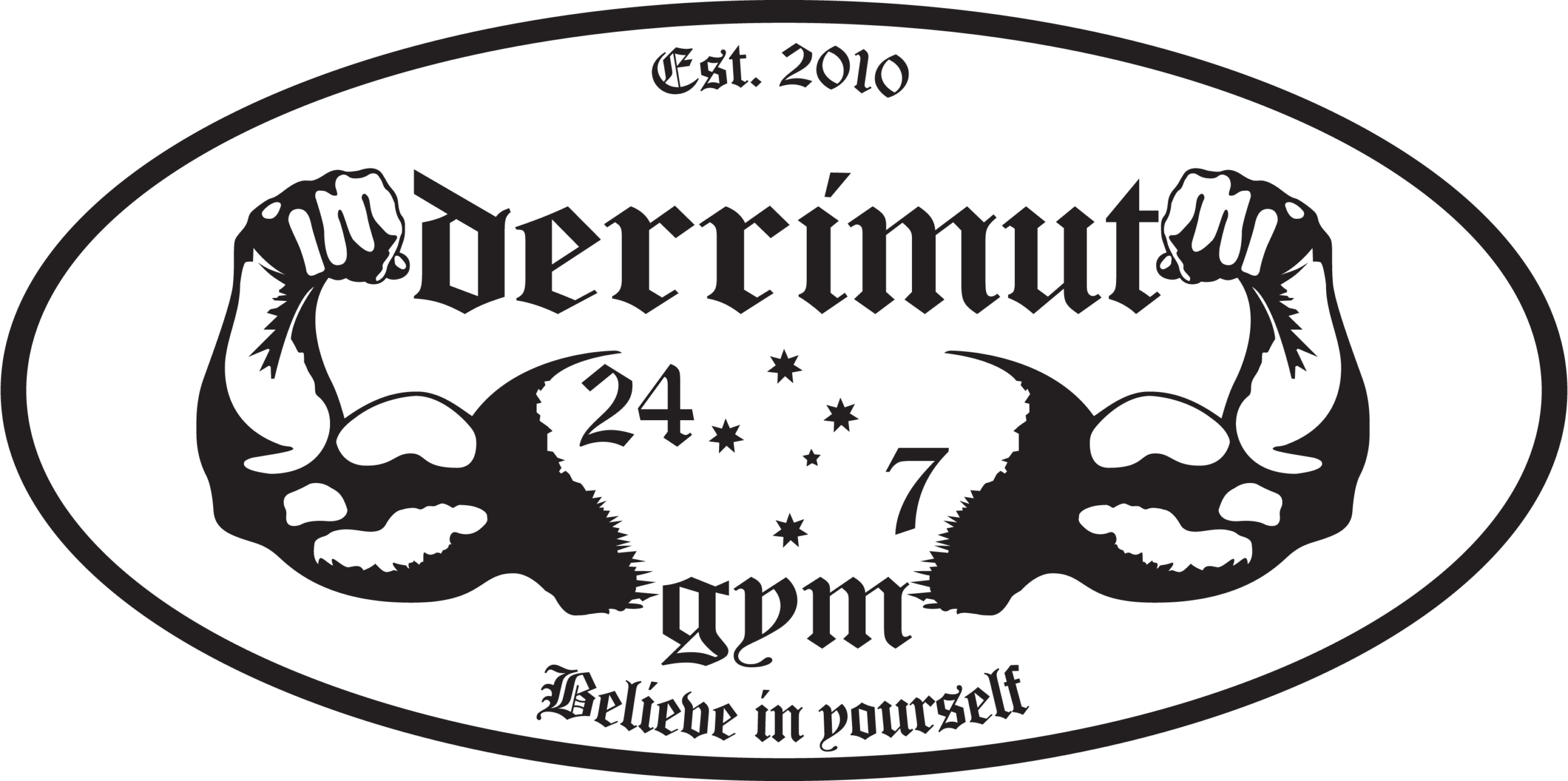
2. Logo History
Unlike many large corporations or long‑established brands, Derrimut Gym’s visual identity has remained relatively simple throughout its existence:
Initial Identity
When the brand first established itself in the early 2010s, it adopted straightforward typographic branding that emphasized the name “Derrimut 24:7 Gym” — highlighting both the location and the promise of 24‑hour access. The simplicity made it easy to use on signage, apparel, and digital graphics.
Modern Usage
Over time, the logo has remained minimal and text‑driven, with bolder lettering to convey strength and clarity. Most interpretations of the logo consist of the company name in uppercase black typography with optional graphic elements or positioning that suggests energy and momentum.
Because the gym’s brand identity relied more on its name and services than elaborate visual symbols, the logo’s strength comes from its legibility and straightforward presentation. The minimalist approach makes it suitable for merchandise, signage, and online branding.
3. Logo Design Meaning
The Derrimut Gym logo is intentionally simple and direct, communicating key elements of the brand’s identity:
Typography‑Driven Design
The logo relies primarily on bold, uppercase typography that projects strength, professionalism, and reliability — qualities essential for a gym brand. Strong lettering conveys a sense of firmness and commitment, echoing the physical discipline associated with workouts and training.
Reference to 24/7 Fitness
Including “24:7” in the name and logo communicates the idea of round‑the‑clock access, even though some locations later changed their opening hours. This element was a crucial part of the gym’s appeal, creating a promise of flexibility and accessibility to members.
Fitness and Movement
While not overtly graphic, the boldness and structure of the lettering reflect energy and motion — essential concepts in fitness branding. Simplicity in design also makes the logo versatile for use on gym walls, apparel, equipment, and digital interfaces without losing clarity.
4. Color Philosophy
Although specific versions of the Derrimut Gym logo may vary slightly in how they display the text or additional graphic elements, the primary color philosophy focuses on neutral, strong shades:
Black (#000000)
Black is the dominant or most commonly used color for the Derrimut Gym logo. This color represents:
- Strength and authority
- Bold contrast and readability
- Timelessness and professional appearance
The use of black helps the logo remain clearly legible across a wide range of applications — from large storefront signage to small merchandise and digital platforms.
White Background
A plain white background is often paired with the black typography to enhance contrast, improve visual impact, and ensure that the logo stands out clearly against different environments.
5. Cultural and Fitness Industry Significance
While Derrimut Gym’s rise signified the demand for affordable gym access and 24/7 fitness culture in Australia, the brand’s visual identity played an important role in how members perceived it:
- The bold, text‑based logo aligns with practical and no‑nonsense branding found in modern fitness chains.
- Simplicity made the logo easy to reproduce across gym signage, apparel, promotional materials, and online platforms.
- The 24:7 naming and logo conveyed accessibility, even as actual hours of operation shifted in response to operational changes.
6. FAQs (Frequently Asked Questions)
Q: What does the Derrimut Gym logo represent?
A: The logo represents the Derrimut Gym fitness chain, conveying strength, accessibility, and a focus on fitness services.
Q: What is Derrimut 24:7 Gym?
A: Derrimut 24:7 Gym is a network of fitness centres in Australia offering gym facilities, group classes, personal training, and wellness services.
Q: Why does the name include “24:7”?
A: The “24:7” in the name originally signified round‑the‑clock access to gym facilities. While some locations later changed operational hours, the branding still emphasizes flexibility in fitness options.
Q: What colors are used in the Derrimut Gym logo?
A: The logo is typically presented in black typography on white background, providing strong contrast and readability.
Q: Where can I download the Derrimut Gym logo?
A: You can download the Derrimut Gym logo in PNG and SVG formats from PNGLush for informational and design use.