Brand Overview
Founded in 1918 in Dnipropetrovsk (now Dnipro), FC Dnipro became one of the most respected football institutions in Ukrainian and Soviet football. The club’s history includes domestic honours and a remarkable run to the UEFA Europa League Final in 2015, where it competed on the European stage against top clubs. Over decades, the name Dnipro became synonymous with gritty football, passionate support, and strong performances at both national and continental levels.
Despite financial difficulties and eventual dissolution around 2019, the legacy of FC Dnipro lives on through its fans and football heritage.
Logo History
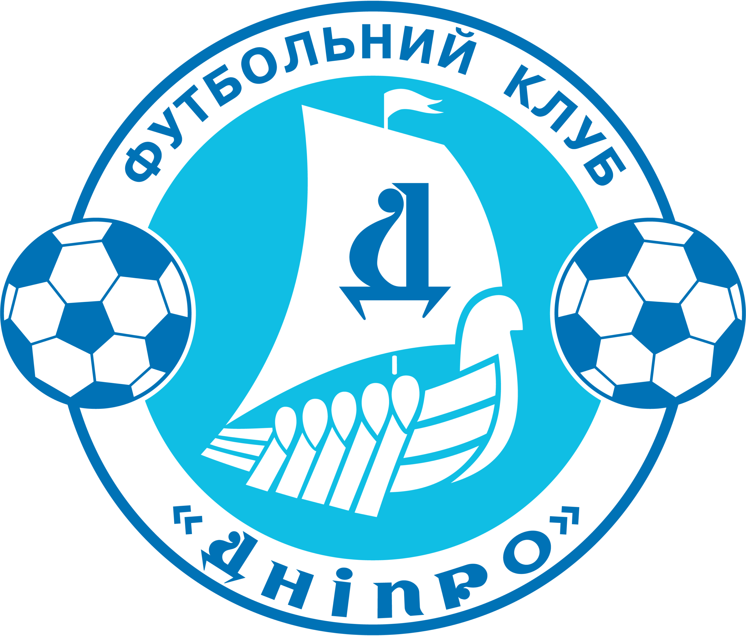
The logo of FC Dnipro Dnipropetrovsk has evolved as the club grew and adapted to modern football branding. A well-known version used from the early 2000s features a circular badge with a central maritime theme and football imagery — reflecting both local heritage and the sport itself.
Historically the club also used older forms and variants tied to different eras of competition, but the core identity remained recognizable: a blend of sporting symbolism and references to the city’s culture and location.
Design Meaning
The logo incorporates several meaningful elements tied to the club’s identity:
- Central Ship Image: A stylized ship often appears at the heart of the logo. This symbolizes journey, resilience, and forward movement — fitting for a club that charted a long and challenging path in competitive football.
- Letter “Д”: Prominently displayed on the sail in Cyrillic (the local alphabet), this letter stands for “Dnipro”, anchoring the badge in its local linguistic and cultural roots.
- Football Motifs: Classic football imagery (such as soccer balls) emphasizes the club’s core purpose and achievements on the football pitch.
- Circular Badge: The traditional round logo format conveys unity and continuity, both important traits for a team with deep community ties.
Together, these elements communicate a sense of tradition, regional pride, and sporting purpose.
Color Philosophy
The club’s visual identity typically used a blue and white palette, chosen for its clarity, visibility, and strong association with the team’s uniforms and branding:
- Blue: Represents loyalty, strength, and tradition — qualities associated with the club’s competitive history.
- White: Offers crisp contrast and clarity, ensuring the logo stands out across media, jerseys, and promotional materials.
This combination ensured the emblem remained distinctive and recognizable whether displayed on kits, banners, digital platforms, or merchandise.
Usage Guide
When using the FC Dnipro logo or related artwork, consider these general design principles:
Maintain Proportions
Scale the logo uniformly. Avoid stretching or compressing in any direction.
Clear Space
Surround the logo with enough whitespace to preserve its visual integrity and avoid distractions from other elements.
Background Contrast
Ensure the logo is placed on backgrounds with strong contrast for optimal visibility and legibility.
File Quality
For print or large formats, use high-resolution or scalable vector versions to prevent distortion or pixelation.
Preserve Design
Do not alter the logo’s colors, graphic elements, or typography unless you have official variations or permissions.
Following these practices keeps the logo professional, recognizable, and respectful of its heritage.
FAQs
1. What does the Dnipro logo represent?
The logo reflects the club’s identity — its sporting journey, local heritage, and traditions of Ukrainian and European football.
2. Is FC Dnipro still active?
The original club ceased competing at the top levels and was effectively dissolved around 2019 due to financial and administrative issues.
3. Why is there a ship in the logo?
The ship symbolizes forward movement, resilience, and regional identity — values tied to the history and spirit of the club.
4. Can I use the Dnipro logo in my project?
Using official logos generally requires permission from the rights holders. Editorial or educational references may be acceptable in context, but check legal and usage standards.
5. What colours are associated with the logo?
Blue and white are the key colors, representing loyalty, strength, and clear visual contrast.