Hogwarts Logo – Brand Overview, Logo History, Design Meaning & Color Philosophy
The Hogwarts logo is one of the most iconic symbols from modern fantasy literature and film, instantly evoking the magical world of witches and wizards. Whether you’re downloading the Hogwarts logo in PNG or SVG format or just want to understand the story and symbolism behind it, this article explores the brand’s identity, logo evolution, design meaning, color philosophy, and frequently asked questions.
Brand Overview
The Hogwarts logo represents Hogwarts School of Witchcraft and Wizardry, the central magical school in the Harry Potter universe. In the stories, Hogwarts is an ancient, prestigious castle where young witches and wizards receive magical education. It is a place of wonder, tradition, friendship, and transformation — and its emblem serves as a visual shorthand for everything the school stands for.
Even outside of the books and films, the Hogwarts crest has become a cultural symbol for fantasy, imagination, and the idea of a school where students grow into their best selves through challenge and discovery.
Logo History
The Hogwarts logo as most people recognize it today was popularized through the Harry Potter movies, theme parks, merchandise, and related media. Its origins are tied directly to the fictional lore created by the author of the Harry Potter series.
Literary Origins
Before the films existed, the crest appeared in illustrated editions of the books and on official companion materials. These early visual representations helped establish the look and feel of the Hogwarts identity for readers.
Film Era Standardization
When the Harry Potter film franchise launched, the Hogwarts crest was standardized into a detailed emblem used across:
- House banners
- Uniform crests
- Props and set design
- Official merchandise
This cinematic version became the definitive Hogwarts logo for a global audience.
Modern Usage
Today, the Hogwarts logo exists across multiple formats — from high-resolution digital downloads to animated versions in theme park media and branding. While original designs vary slightly with stylistic adaptations, the core structure and symbolism remain consistent.
Design Meaning
The Hogwarts logo is rich in symbolism, carefully constructed to reflect history, identity, and values within the magical world.
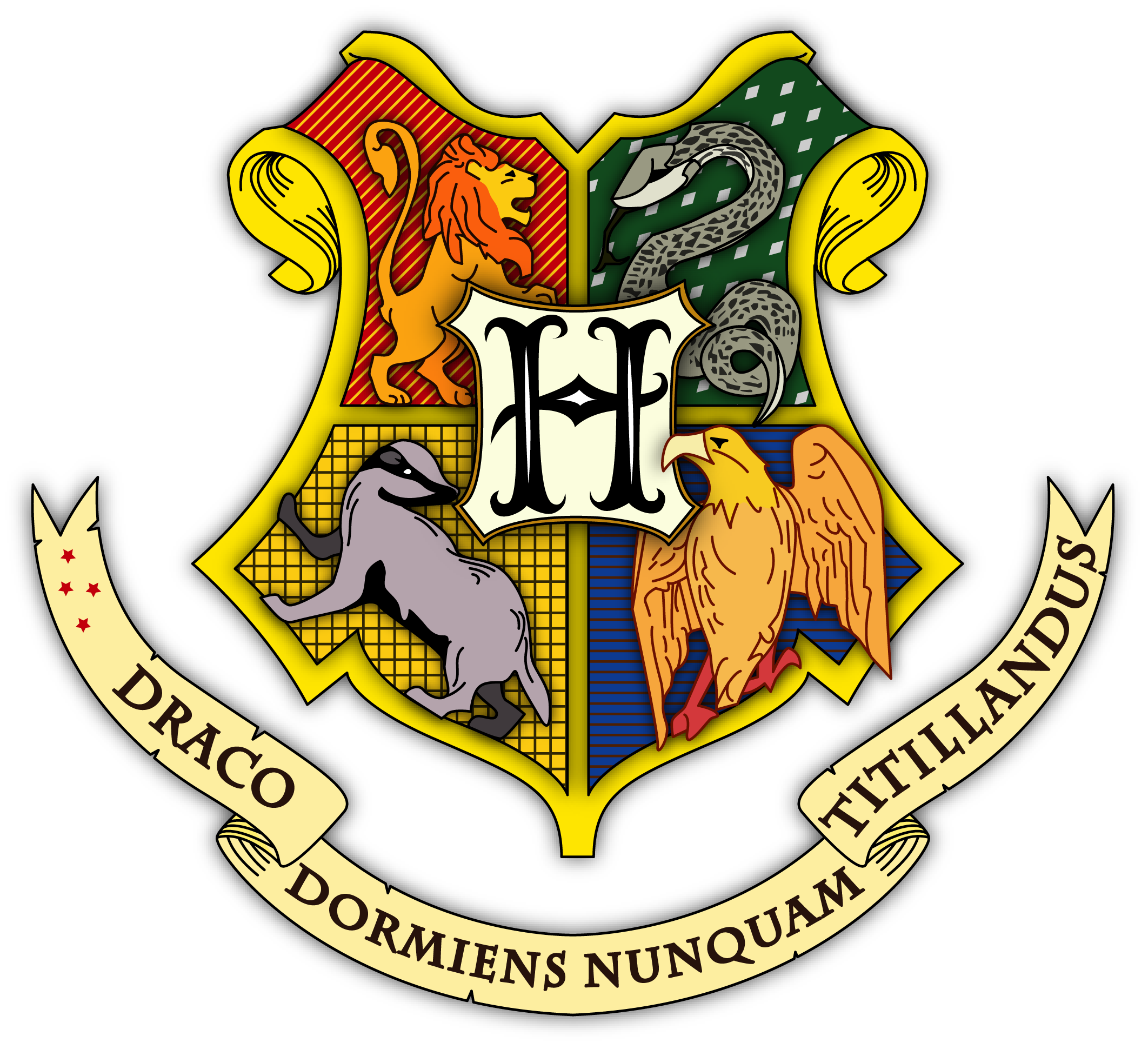
1. Four House Animals
At the heart of the crest are four icons, each representing one of the school’s houses:
- Lion: Courage and bravery
- Eagle: Intelligence and wisdom
- Badger: Hard work and loyalty
- Serpent: Cunning and ambition
These animals surround a central shield, symbolizing the unity of diverse strengths under one institution.
2. The Letter “H”
The bold letter “H” at the center stands for Hogwarts itself — the school that brings together students from different backgrounds and house traditions.
3. Shield Structure
The overall shield shape evokes tradition, protection, and heritage. Like many heraldic emblems, it suggests a long history and deep roots — fitting for a school said to have been founded centuries ago.
4. Ribbon and Motto (When Present)
Some crest variations include a ribbon at the base with the motto Draco Dormiens Nunquam Titillandus — Latin for “Never tickle a sleeping dragon.” This whimsical line reflects both magical seriousness and a playful spirit intrinsic to the school’s culture.
Together, the elements express a balance of individuality and unity. Each house contributes its values, yet all are part of the greater Hogwarts identity.
Color Philosophy
Color plays a meaningful role in the Hogwarts logo, adding emotion and visual clarity to the emblem.
Primary Tones
The Hogwarts crest traditionally uses:
- Deep red: Symbolizing bravery and passion
- Rich green: Representing ambition and resourcefulness
- Deep blue: Standing for wisdom and intelligence
- Bright yellow or gold: Denoting energy and loyalty
- Black or dark accents: Providing contrast and visual weight
These bold colors are tied to the four houses, reinforcing their identities and making the crest visually striking.
Contrast and Legibility
The use of contrasting hues ensures that each house symbol is easily identifiable even at small sizes. Strong contrast also helps the crest stand out on uniforms, banners, websites, and printed materials.
Harmony Through Balance
While the house colors are distinct, they are arranged symmetrically within the crest. This balance reinforces the idea that while each house has unique values, they are part of a unified whole.
Why the Logo Works
The Hogwarts logo endures as a powerful symbol because it:
- Conveys Narrative Depth: Each visual element ties back to story, character, and tradition.
- Balances Unity and Diversity: The crest visually unites four distinct identities into one whole.
- Is Highly Recognizable: Even outside the fictional universe, the design is widely known.
- Appeals Emotionally: It evokes nostalgia, wonder, and imagination for fans of the series.
- Scales Across Media: From small icons to large banners, it works in print, digital, and physical environments.
This combination of meaning, aesthetic strength, and adaptability makes the crest much more than a decorative graphic — it’s a cultural touchstone.
Frequently Asked Questions (FAQs)
What does the Hogwarts logo represent?
It represents Hogwarts School of Witchcraft and Wizardry, including its four houses and the values they embody: courage, intelligence, loyalty, and ambition.
Has the Hogwarts logo changed over time?
The core elements have remained consistent — the four house symbols, the shield, and the central “H.” Stylistic updates have occurred for different adaptations, but the overall design remains rooted in tradition.
Why are there four animals in the logo?
Each animal represents one of the four Hogwarts houses, which are major parts of student life and identity within the school.
What is the motto associated with the crest?
The motto often shown with the crest translates to “Never tickle a sleeping dragon,” a playful guideline that reflects magical wisdom with humor.
Can the Hogwarts logo be used freely?
No. The Hogwarts logo is part of the intellectual property associated with the Harry Potter universe and its licensing. Commercial or public use outside of authorized contexts is restricted.
Final Thoughts
The Hogwarts logo is more than a fictional emblem — it’s a symbol of imagination, identity, and the enduring appeal of a world where magic and learning come together. With its rich symbolism, thoughtful color choices, and narrative depth, the crest connects deeply with fans around the world. Whether you’re a designer, storyteller, fan, or creative enthusiast, understanding the meaning behind the Hogwarts logo enriches your appreciation of this iconic mark.