Brand Overview
Virgin Atlantic is a major British airline known for its innovative approach to aviation, premium customer experience, and distinctive brand identity. Founded in 1984 by entrepreneur Sir Richard Branson, Virgin Atlantic quickly established itself as a challenger airline with a reputation for bold design, customer‑centric service, and a flair for memorable branding.
The airline operates long‑haul flights between the United Kingdom and destinations across North America, the Caribbean, Africa, Asia, and the Middle East. Its operations are centered at London Heathrow Airport and Manchester Airport, and the company serves both leisure and business travelers.
Virgin Atlantic’s brand extends beyond aviation — its visual identity, marketing campaigns, and customer experience speak to a youthful, stylish, and adventurous ethos that resonates in every part of the airline’s presence.
Logo History
The Virgin Atlantic logo has evolved alongside the airline’s growth and brand maturity, while consistently preserving core elements that signal flight, motion, and modernity.
Early Years (1984–1990s)
When Virgin Atlantic began operations in 1984, the airline adopted a stylized version of the Virgin corporate wordmark originally used by Branson’s Virgin Group enterprises. This early logo paired the familiar Virgin script with aviation elements such as wing‑like strokes, suggesting flight and forward movement.
Throughout the 1980s and 1990s, the airline used variations of the wordmark applied to aircraft liveries, marketing materials, and uniforms. However, the central Virgin script remained the anchor of the visual identity — echoing the simplicity and personality of the broader Virgin brand.
Modern Identity (2000s–Present)
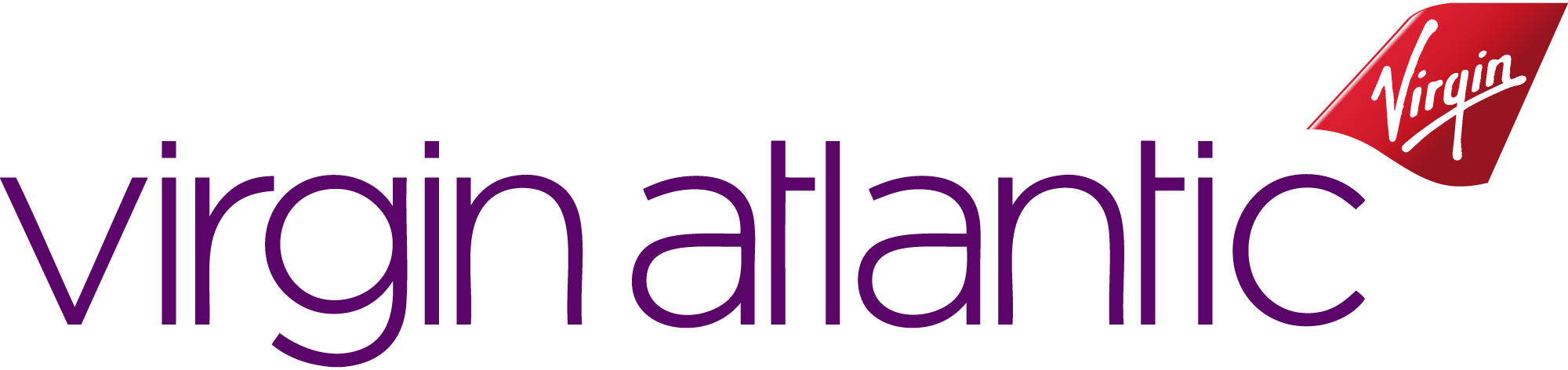
In the 2000s, Virgin Atlantic refined its logo into the form widely recognized today. This modern identity features:
- The handwritten Virgin wordmark in bold red
- A dynamic italicized font indicating motion
- A secondary text element spelling “Atlantic” in clean, sans‑serif typography
The refined combination underscores the airline’s connection to the Virgin Group while establishing a distinctive aviation‑specific identity.
Over the years, this logo has appeared across aircraft liveries, cabin interiors, tickets, digital platforms, and advertising campaigns — becoming a symbol of modern British aviation. Minor adjustments have been made for digital clarity and printing, but the core identity remains distinctive and enduring.
Design Meaning
The Virgin Atlantic logo may appear simple at first glance, but each design element carries intentional meaning that reflects the airline’s personality and mission.
The Virgin Script
At the heart of the logo is the iconic handwritten Virgin wordmark, originally created for the broader Virgin Group and used across many of its companies. It conveys:
- Humanity and approachability — the hand‑drawn style feels personal and engaging
- Creativity and boldness — much like Sir Richard Branson’s entrepreneurial spirit
- Brand unity — the script links Virgin Atlantic with other Virgin ventures such as Virgin Records and Virgin Galactic
Because of its consistent use since the 1970s, the script has become one of the most recognizable corporate wordmarks in the world.
Italicized Typeface
The slanted, dynamic style of the Atlantic text suggests movement and flight, appropriate for an airline. It gives the logo energy and momentum, reinforcing an aspirational idea of travel and exploration.
Clean Sans‑Serif Font
The use of a modern sans‑serif typeface for the Atlantic portion of the logo communicates:
- Modernity
- Clarity
- Professionalism
It balances the expressive Virgin script with a structured, contemporary visual voice.
Color Philosophy
Color plays an important role in the Virgin Atlantic logo’s visual impact and brand meaning.
Red
The signature red used in the Virgin wordmark is a core brand color across the Virgin Group. In the context of Virgin Atlantic, red symbolizes:
- Passion and energy
- Innovation and courage
- Warmth and dynamism
Red is visually striking and memorable, helping the logo stand out on aircraft tails, marketing materials, digital touchpoints, and airport signage.
Dark Gray / Black
The Atlantic text is often rendered in dark gray or black to provide strong contrast with the red script. This choice communicates:
- Professionalism
- Readability
- Stability
It also helps ground the expressive red, giving the overall logo a refined and balanced appearance.
White (Background Space)
White space around the logo ensures clarity and visibility. It allows the red lettering to stand out and keeps the visual presentation clean and modern. Clean white backgrounds are especially important in digital contexts and airline signage.
Overall Palette
The combination of red, dark gray/black, and white creates a professional yet expressive brand identity that is instantly recognizable and deeply associated with the Virgin spirit of bold, stylish travel.
FAQs
Q: What is Virgin Atlantic?
A: Virgin Atlantic is a British airline founded in 1984, known for its long‑haul international flights, bold branding, and customer‑first experience.
Q: What does the Virgin Atlantic logo represent?
A: The logo blends the iconic Virgin script — symbolizing personality, creativity, and human connection — with clean, modern typography that suggests motion, clarity, and professionalism.
Q: Why is red the main color of the logo?
A: Red represents passion, energy, and innovation — qualities that define Virgin Atlantic’s brand personality and help the logo stand out visually in airline and marketing contexts.
Q: Has the Virgin Atlantic logo changed over time?
A: Yes. While the fundamental Virgin script has remained constant, the overall logo has been refined over time to improve clarity, balance, and digital performance. The current version is a polished evolution of earlier designs.
Q: Is the Virgin Atlantic logo trademarked?
A: Yes. The Virgin Atlantic logo is protected under trademark laws and is owned by Virgin Atlantic Airways Limited.